Devlog 5: That's all folks!
The testing session tutorial has come and gone, and had gained an abundance of helpful feedback to help give us new ideas on how to better fix our game to make it more enjoyable for players, and we are also in the last week! So this will be the last devlog as we wrap things up and get ready for submission, it's been an honor writing these devlogs for you. Without further ado, let's get onto what's been happening in our last week of development before submission:
Now in this devlog I won't be going into tonnes of detail here about our testing session and the feedback we received, that's part of a different assignment (4), of which you can read ours here: https://docs.google.com/document/d/11yGrav11X29SoohbCEfZHvwgcBUBMviski54kk9bemk/...
But some of the changes we have made in the last week have been because of feedback, so I mention when that is the case. Let's get started!
Firstly, the city has been rearranged and features the new building that wasn't quite ready for being placed in-game the other week, and alot of the early buildings i had created were updated by me because they were lower in quality compared to the rest, and their updates were placed in game too! Sorry, I want to embed a before and after slider for you but the only way I can find to do it is by making it on codepen and embedding that, すみ ません!
You may notice the buildings were made darker, this is because the buildings were previously very bright, testers found it hard to differentiate the background from the foreground during play, especially when the gameplay got more chaotic, simply making the background darker easily fixed these woes, and looks alot better (I think anyway)! There was a little easter egg hidden in the above slider images, did you catch it? If you did, good on you! If you didn't, I'll point it out for you, the new player ships have arrived!
(Protip: you can see all sorts of cool extra stuff by opening the "model inspector" in this little widget, try it out! Especially the wireframe!)
Check it out! It might not look like much up close with that bare sphere shape, but it looks great side on when in game, and is a more suitable and comfortable shape for clicking and dragging opposed to the awkward shape of the original ships.
Aiden has been working on lots of great UI changes, let's have a look at some now in a quickfire fashion!
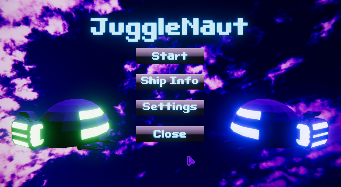
You may remember our previous ugly first iteration of the game menu, it has been updated now and it looks glorious, the background scrolls just like ingame, but faster, and there is a mysterious new button in the middle... "Ship Info"? What could it mean... Dare we click...?
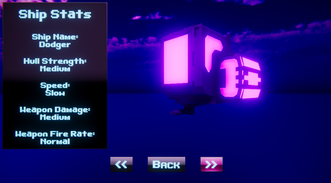
Oh my, it's a completely new screen that shows enemy models (that rotate) and their stats, using the left and right buttons on the bottom of the screen we can check the info for every single enemy type! How cool is that! Now players that want to try a bit harder and learn enemy types and stats are able to do so! You may have also noticed a "settings" button. I wonder what is in there???
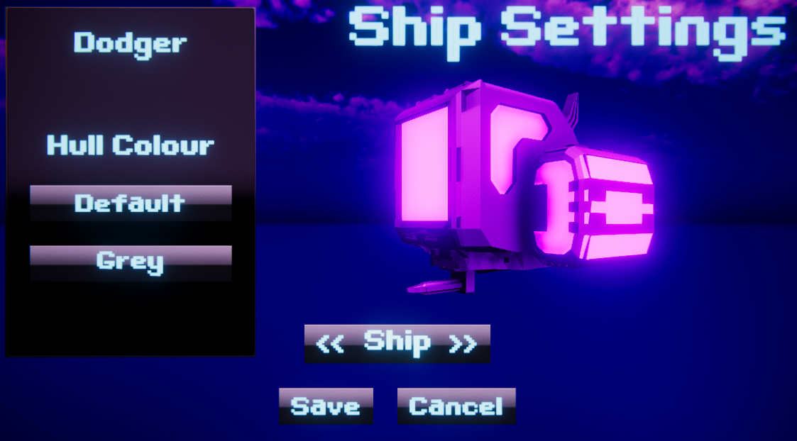
This cool idea from Aiden allows the player to set the hull color of each enemy type! You can chose the game's built-in color or a standard grey, this can be used by players who have vision impairment or color blindness! Or maybe you just want to change the look of a ship you don't like, that's totally okay! Let's have a look at the same ship with Grey selected:
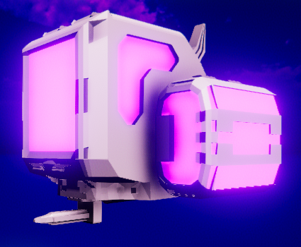
A very cool and useful feature to be sure, but we can't stay on it any longer, there is many (many) updates to talk about! 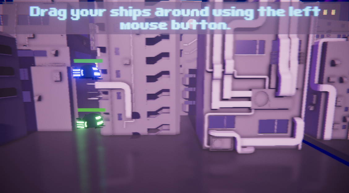
Jumping into the game the player is now met with this message to tell them how to play, the game does not begin until the player has moved one of the ships a sufficient amount of distance. This was a common point of feedback, and we knew it would be. We always wanted this feature but sadly didn't have time to implement it over more important features, oh well! It's here now! :) Moving on...
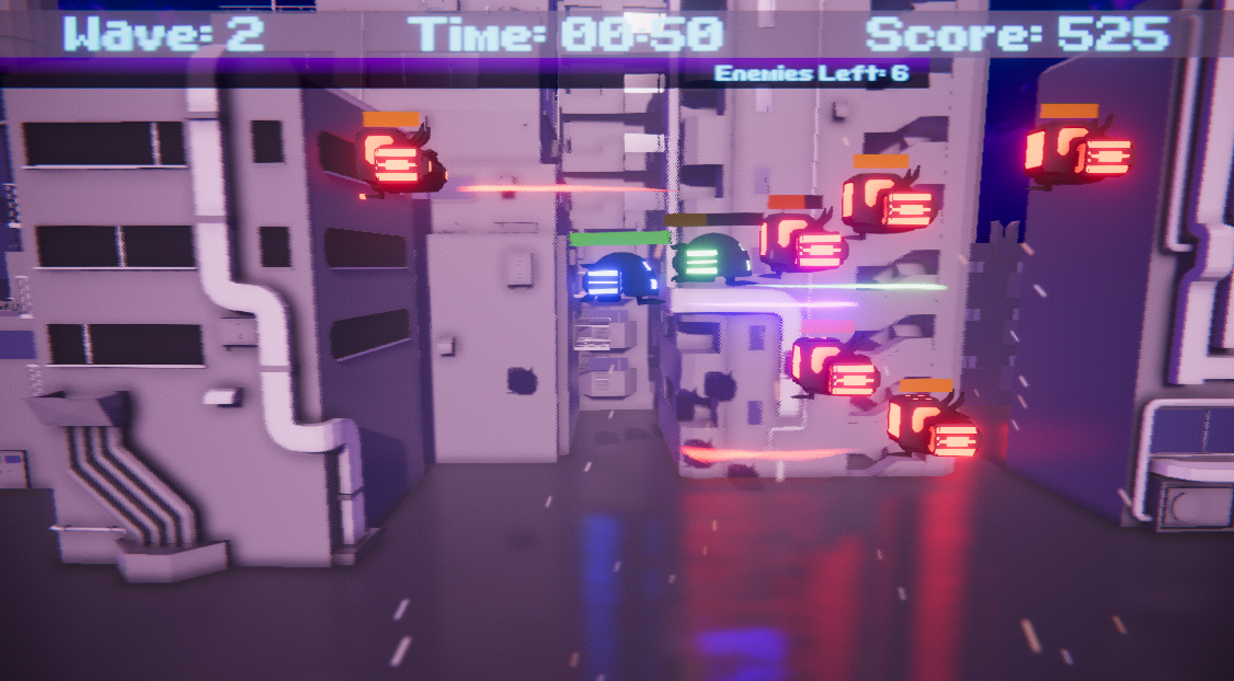
We have a freshly redesigned UI, it shows the player's current wave, time they have been alive and their score, and below all that is a bar that depletes, showing the amount of enemies left in that wave.
Continuing the theme of UI we also have a newly redesigned game over screen!
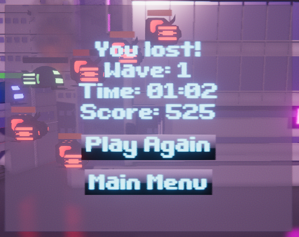
It shows you all your statistics of your session up until you died, make sure you do well so you don't have to face terrible shame like this gameover screen above, you couldn't even make it to wave 2? Embarassing...
One thing our game *really* lacked was player feedback, we spent alot of time implementing new features for this, let's look:
Among a new musical track in the background may notice some new things relating to player feedback, almost every interaction has a sound now, more importantly enemies getting hit and dying have their own sounds which is important, combined with that is a new enemy death interaction. Enemies on death now have particle effects (an explosion, sparks and smoke), their lights turn off and they fall to the fast- scrolling background to be swept off of the screen with the background. Among that, there is a new "PopupText" implementation by myself (Issung) that you may have noticed. This has a very classic arcade-ish type feel to it, especially because of the 8bit font (BitDarling), it tells the player what has happened, and what it does too, for example +75 tells the player that the enemy has died, and it has given 75 points! No need for on the fly arithmetics to try and find out how many points each enemy gives. This is also done for powerups, to tell the player they have picked one up, and what it does too! You can tell why this method is used in many games, it is very informative to the player!
You may have also noticed this in that short video!
This is a new powerup we have developed, it is a shield and it protects the player from enemy bullets so that the player doesn't take any damage, instead the shield takes the damage, and once it takes a certain amount it breaks (we are still deciding the amount, don't want it to become too overpowered).
Now that our game is feature complete and has a good amount of polish that gives the player a satisfying gameplay experience we believe that our game is now finished! Maybe also because of the deadline... We had alot of fun making this game together and learnt alot in the process, not just about programming and modelling, but also about teamwork :)!
Thanks for sticking with us through the devlogs, we hope you enjoyed reading them all, and as always, I hope you learned something 😁!
JuggleNaut Prototype
Game prototype made by myself & a partnet as a University project
More posts
- Devlog 4: Crunching for Testing and Feedback!Oct 15, 2019
- Devlog 3: Thinking of a subtitle...Oct 11, 2019
- Devlog 2.5: Modelling Buildings; The Importance of Pipes!Oct 11, 2019
- Devlog 2: Still Humble Beginnings...Oct 09, 2019
- Devlog 1: Humble BeginningsOct 09, 2019
Leave a comment
Log in with itch.io to leave a comment.